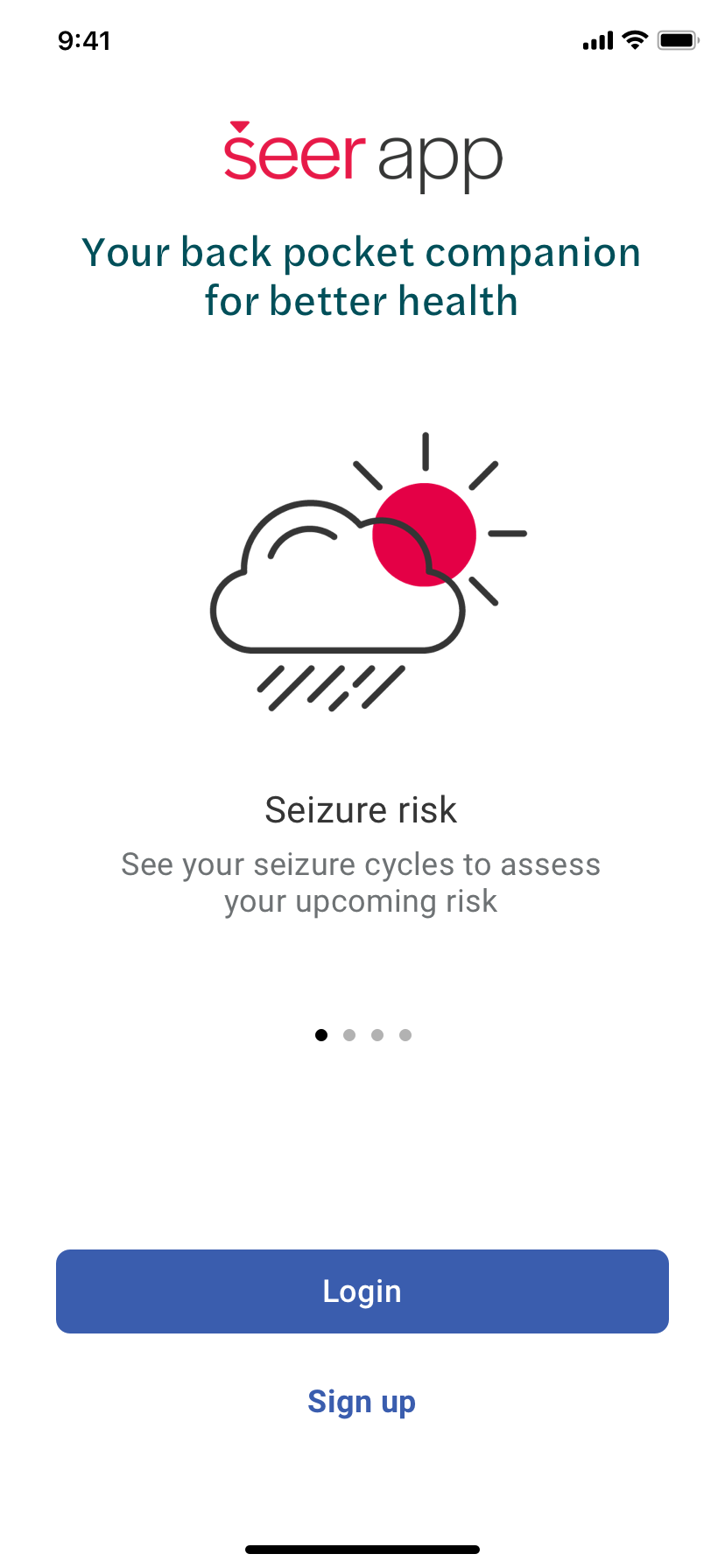
This story is about progress. Sometimes apps or products seem to be an overnight success. More often, I’ve found it’s a process of learning, iterating, and persevering against the odds.
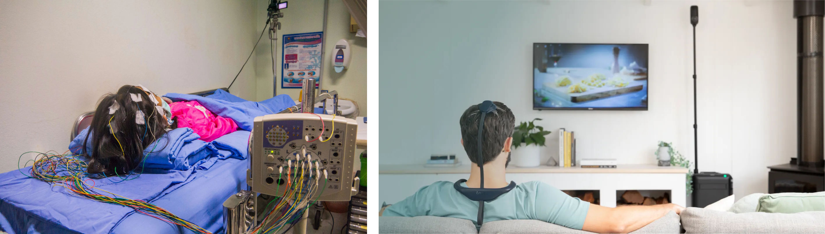
When I joined Seer Medical, it was a rising star in Victoria’s med-tech scene. They provided gold standard diagnostic monitoring services with more than 20 clinics across Australia. Monitoring happened from the comfort of home with award-winning CE wearables that otherwise required being tethered to a hospital bed for 7–10 days or more. A hospital setting may be necessary, but can be so different from typical living conditions to not yield useful insights. Not to mention, AU wait times were shocking.
The task at hand
At first, my job was to improve the patient mobile app experience used during monitoring, to elevate the app to best in class. Before I dive in, I want to credit the original teams of researchers, scientists, devs, and as I understand it, a solo UX’er before me. Starting from scratch isn’t easy — where going from 0 to 1 can be as hard as 1 to 10 or 10 to 100. Before me, Seer had completed nearly 1,000 monitored patients, and during my time accelerated to 5K and 10K monitoring milestones. No small feat all around.
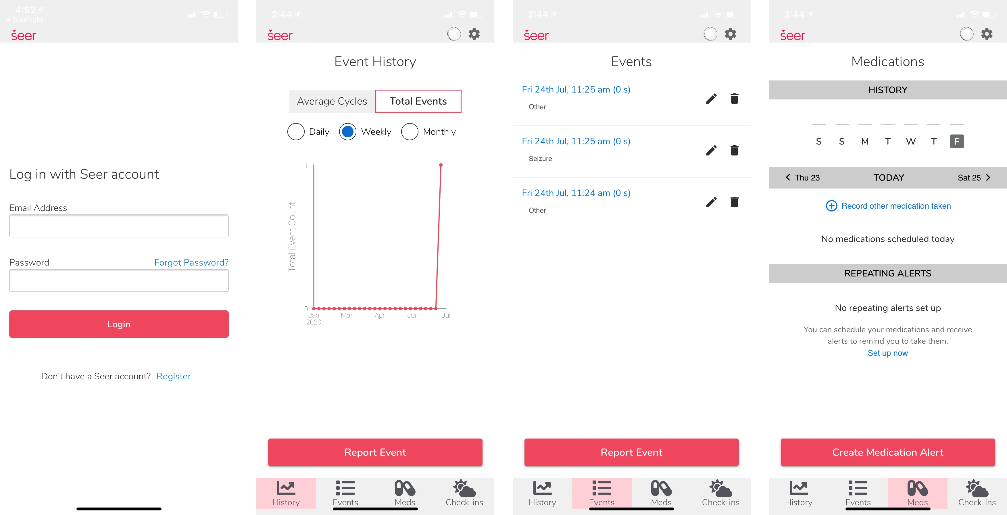
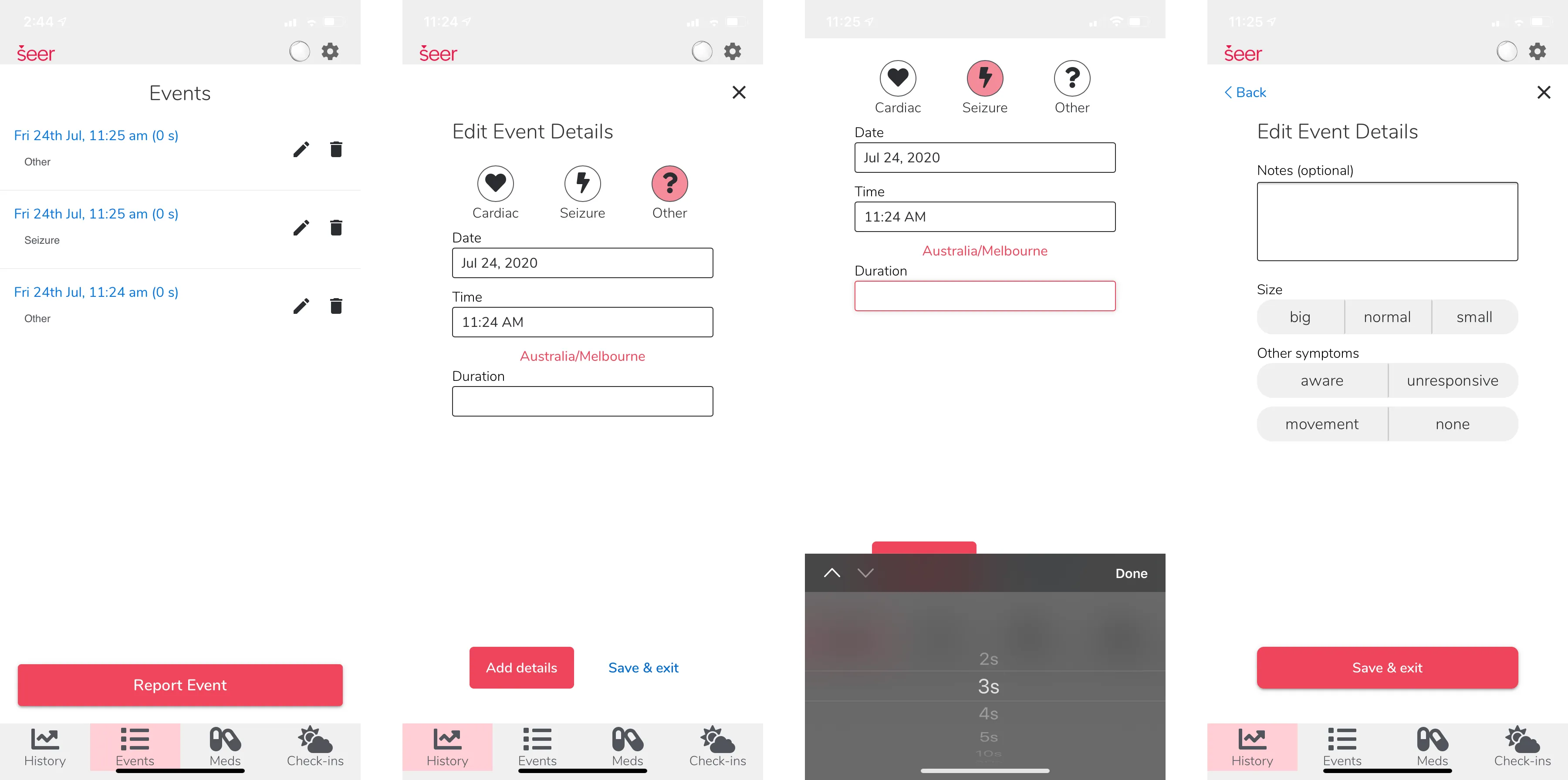
So let’s dive in to the original mobile app that was live and in use when I joined with some key screenshots:
The brief
The brief was to uplift the entire app, improving it’s usability and styling to feel more modern with the latest usability standards and branding guidelines, and set some foundations to transition the experience from diagnostic monitoring during the 7–10 day funded study, to a more beneficial approach of long term management: before, during, and after monitoring.
We also aimed to broaden use beyond our AU monitoring footprint, and initially the focus was keeping it entirely free to use. I wasn’t precisely aware of this right at the start, but it was also underpinning cohorts of clinical research trials, based on specific login credentials, so while there was some creative freedom to modernise usability and update the look and feel to Seer’s freshest branding, this was part of an approved medical device and diagnostic service.
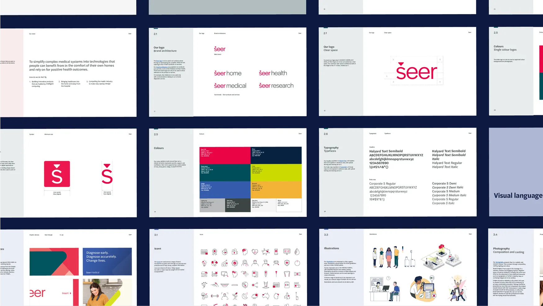
While competitive and market research got underway in parallel, as well as insights to better understand the target user-base, I also kicked off work to quickly re-skin a material design system foundation that could be implemented with the new native apps for both iOS and Android, and eventually for the suite of web products.
We were fortunate to have top-tier creative resources from our marketing and brand team, so we could focus on crafting the UX and the UI around it. You can see a deeper dive on the brand evolutions from one of the absolute champions at her portfolio site: https://jessicasneddon.com/Seer
To note some UX issues with the initial screens, the team aimed to utilise an approach of entering an email only at first, to determine if the user had registered. I discovered that operationally patient emails were often registered to schedule the hardware connection and send patient registration forms. This could delay clinical ops for patients who never got the app or set any password. Also, returning users, including internal teams, noticed delays from a single-step login process using saved credentials.
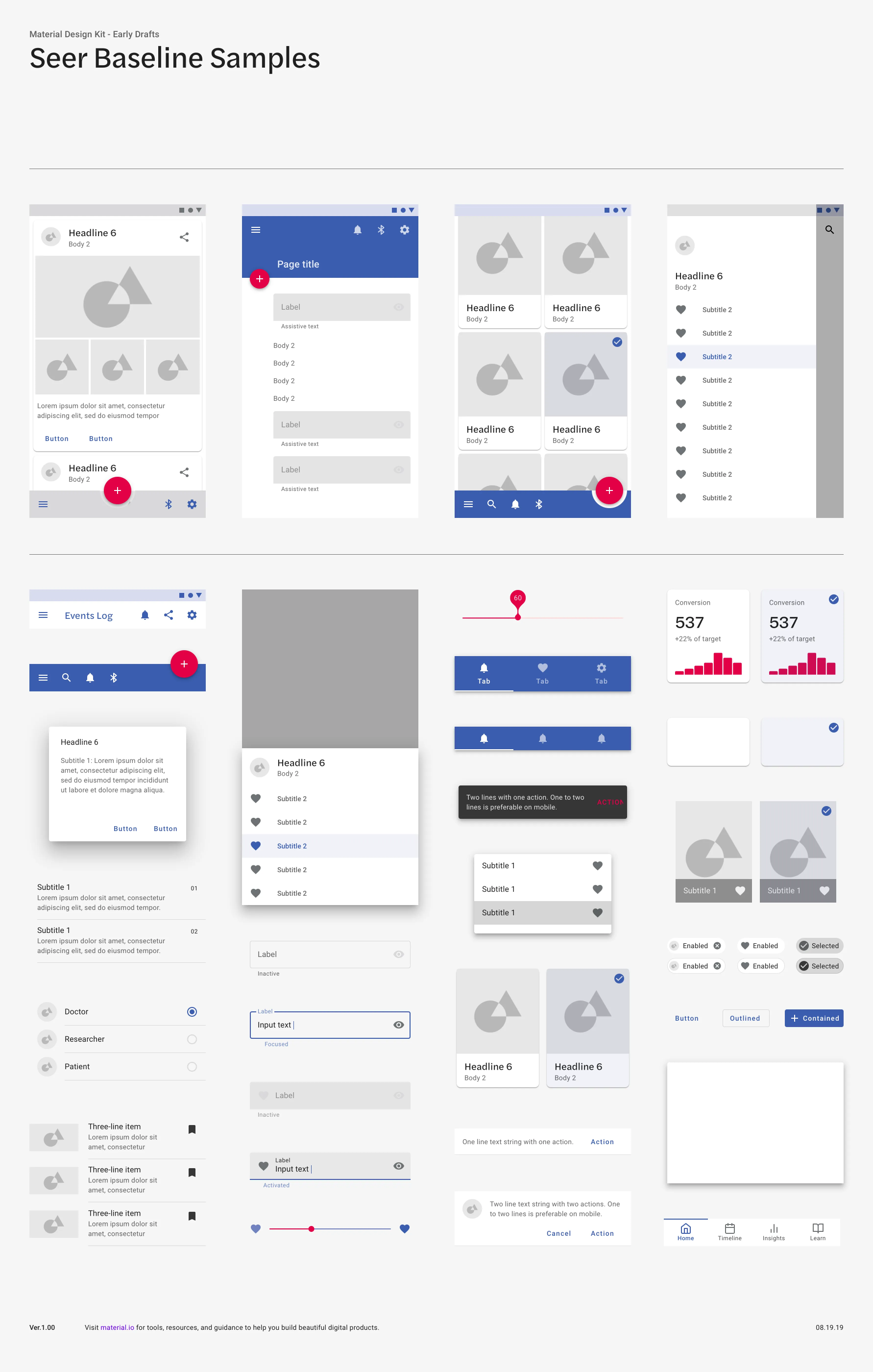
Visually, the material design samples below showcase a (very) early draft that was evolved extensively, but helped to reset our UI foundations with research-backed patterns accepted for usability, discoverability, and visibility, while establishing design patterns that could be relied on to quickly develop the app with common principles. With more designers I would have liked to have more native components for each platform, but as there were only 2 designers supporting all of software engineering we aimed to start with a system that we could expand upon.
Additionally, some key clinics were identified that would assist with rolling out early versions of the new app in parallel to existing processes to gather user-feedback within the clinical setting, with the option to fallback to the existing app in the case of any difficulties. This helped benchmark how new experiences were performing on a smaller scale before introducing the new app for full-scale rollout to all clinics nationally and eventually retiring the old app once the clinical trials running on it were eventually able to also transition.
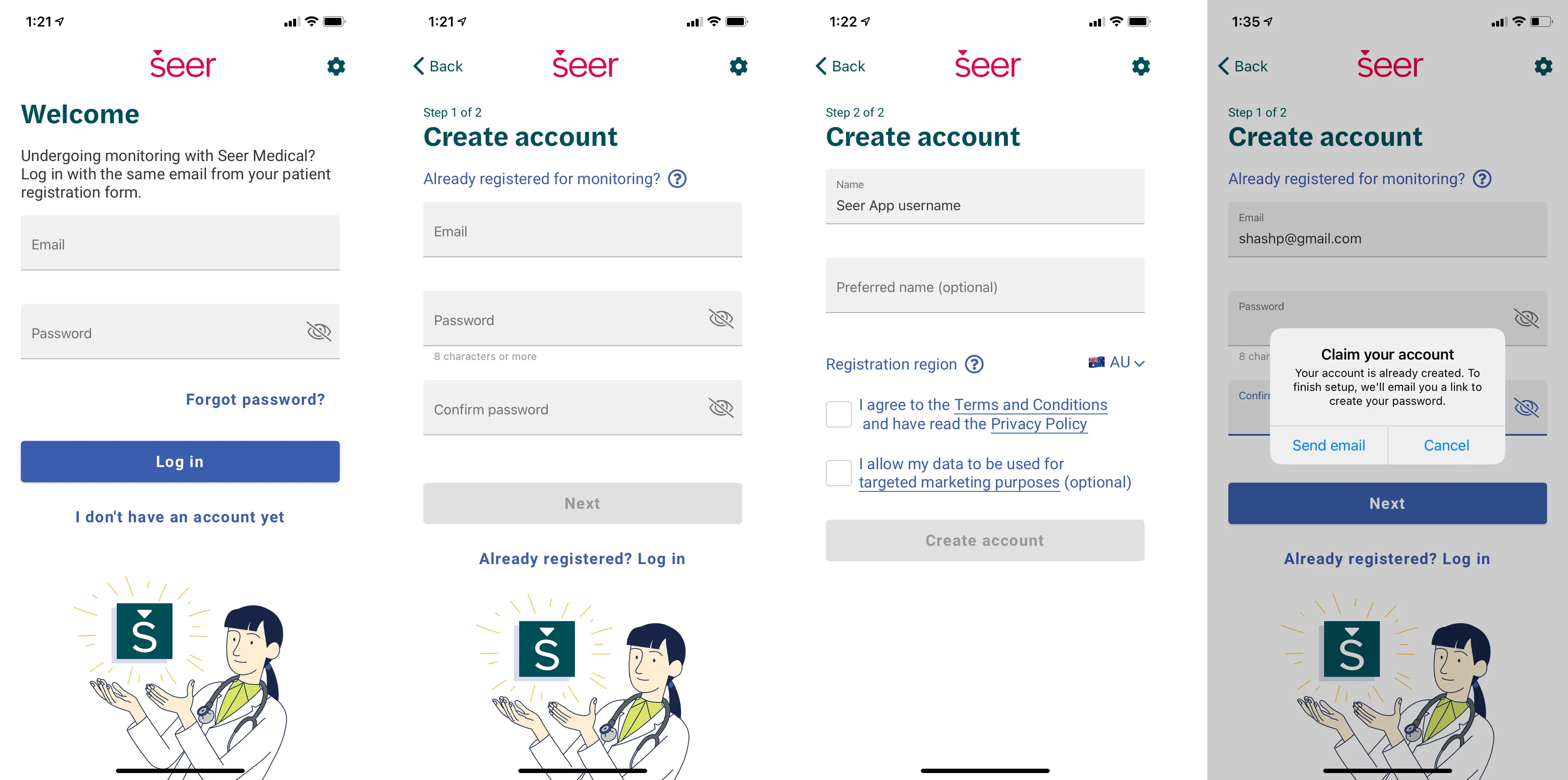
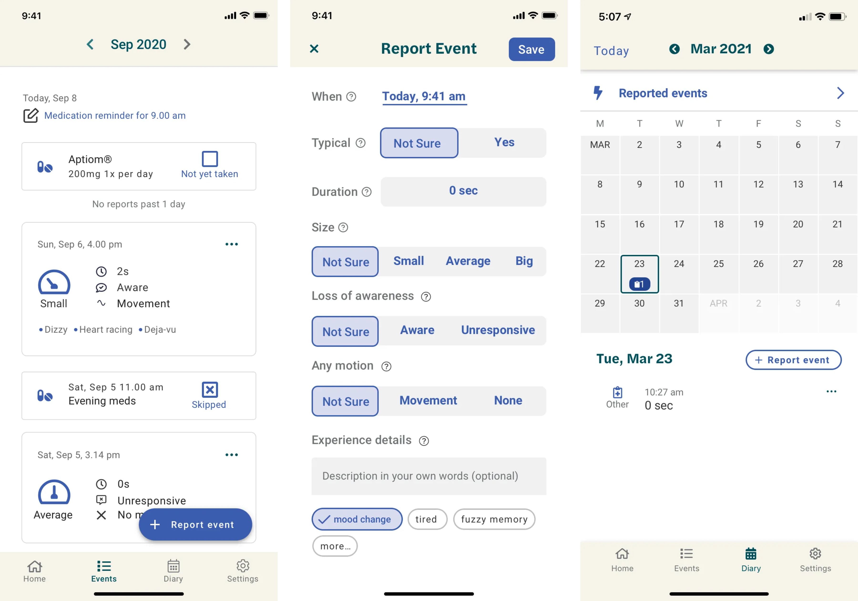
The redesigned login, and later also intro screens, were more approachable, on brand, and resolved login delays for returning users with saved credentials. The creative assets were aligned with other print and digital touch points across the brand. Importantly, the introduction of a ‘claim account’ process enabled users to retrieve an email link to set/recover a password. This helped close key pain points reported by our clinical teams for aligning patient data to the study performed and helped us establish processes to continue to deliver benefits for these teams and the patients they supported daily.
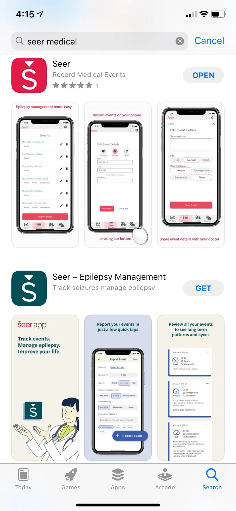
We also overhauled the app store listings for iOS and Android, and introduced some key benefits of using the app before signing up. The original listings used various sized screen graphics that contained key search terms for epilepsy but was difficult to find, even for those that knew the Seer Medical brand.
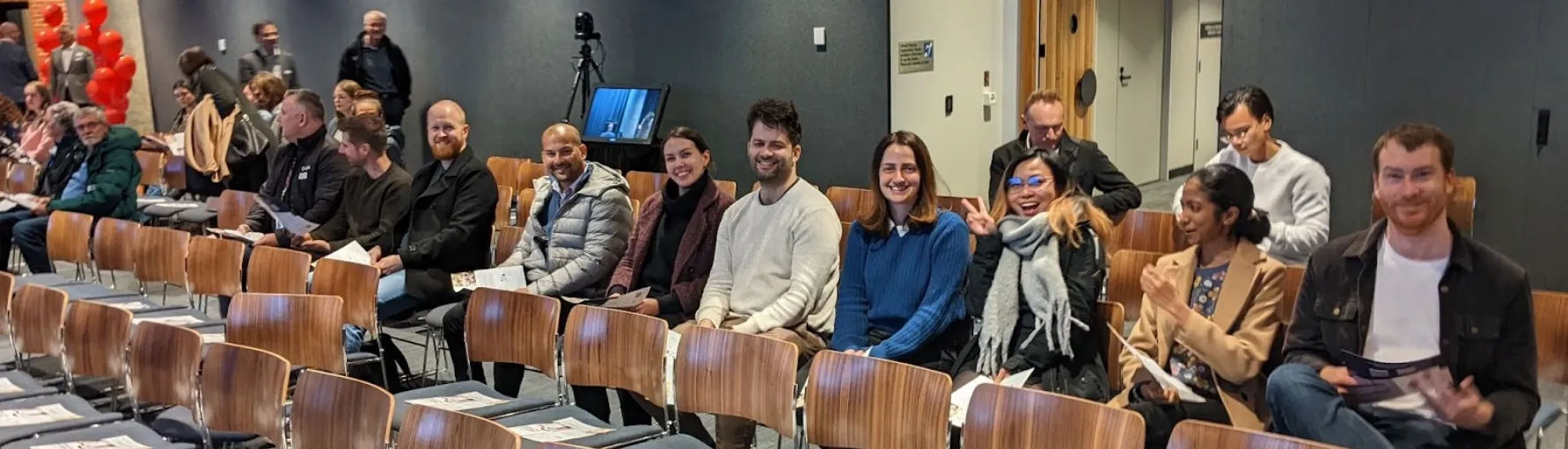
Now, I still believe you can’t suddenly pivot to funding a full design team and expect meaningful results — the practice of good design requires maturity to grow within the culture and balance with other disciplines like product and tech. While I pushed to grow design capacity, we also needed product owners to better guide the shifting priorities on projects. As it stood, we were winning awards, cutting out unnecessary costs and pain points, attracting partnerships like Google FitBit, getting tons of positive press, and even had ScoMo in our HQ to announce billions in federal investments for Aussie grown startups like Seer Medical.
So we have some context, but how did the Seer App go from a line graph in a red mobile app for event cycles to a seizure risk forecast that people could actually start to use? So let’s get back into it:
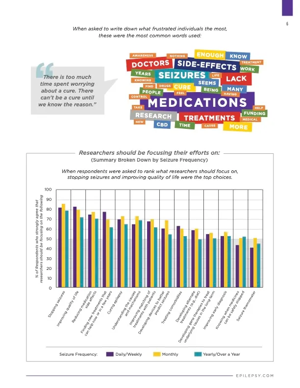
This part of the effort stemmed in part from some compelling data from the Epilepsy Foundation in America that published results from their 2016 community survey, with some insights from over 1k respondents:
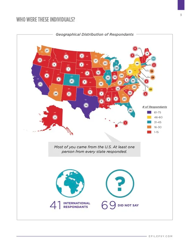
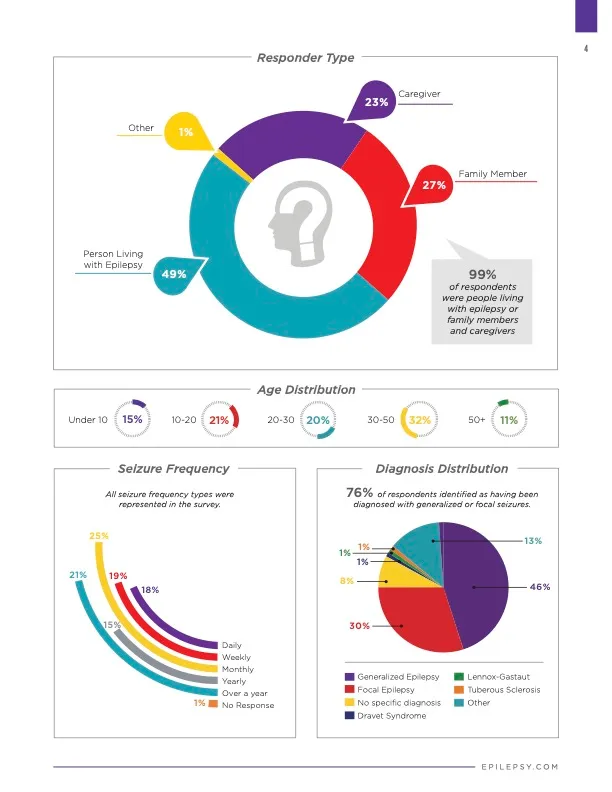
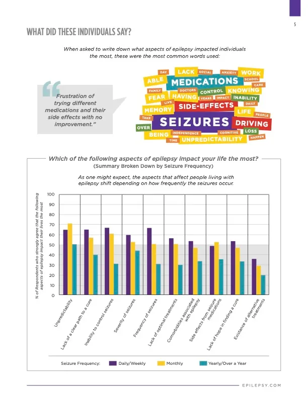
Some of the key insights was that across this sample group, people have a wide range of different seizure frequencies: daily, weekly, monthly or yearly and beyond. It was clear our designs would need to cater for the widest range of frequencies to best address the market.
Also, aside from direct therapies or treatments to control or reduce seizures or severity of them, respondents highlighted improving quality of life and specifically the unpredictability/uncertainty associated with having seizures as top concerns to address.
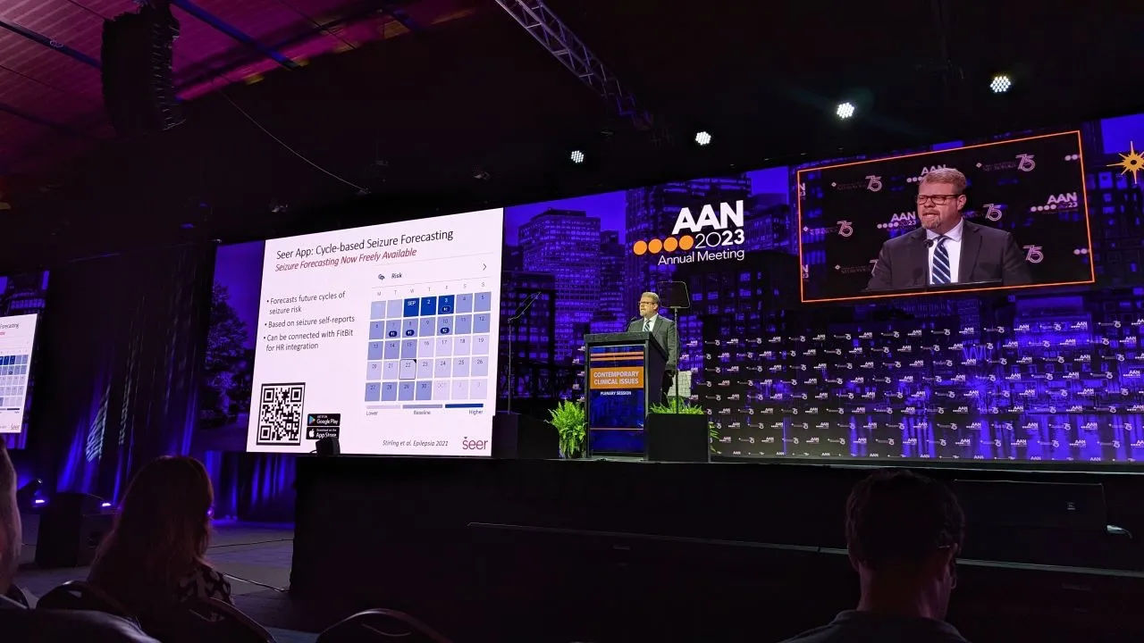
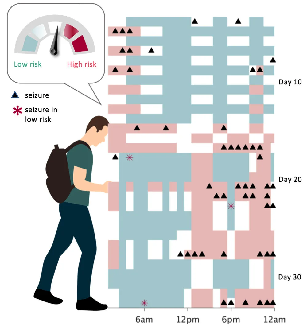
In parallel, Seer Medical’s team was on the forefront of leading research and had been using the Seer App to collect vital information for ongoing research studies, including approaches to forecast events based on underlying seizure cycles. The results of which are nothing short of amazing, but as for an interface to display to users themselves, there was more to be desired as a product in the hands of people living with epilepsy:
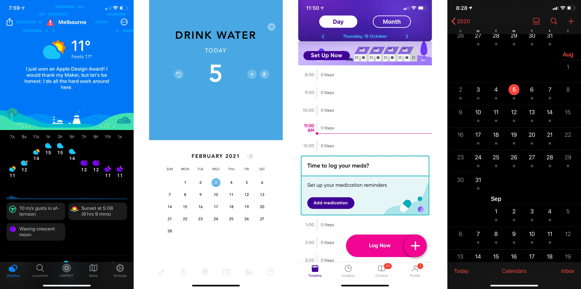
While we researched tons of apps from all different categories, from daily trackers like the OS for the human body, Gyrosco.pe, to snarky award-winning weather apps like Carrot, and dozens of epilepsy apps including some for pets. We rapidly iterated through many dozens of possible displays for the kinds of data we could display. We also considered the various types of users with daily, weekly, monthly, or annual events, and the simplicity of analog clocks and calendars/diaries for tracking a variety of considerations through the days, weeks, or months ahead stood out. These were also a familiar themes mentioned by people living with epilepsy for how they track health outcomes and communicate with their support team.
The essence of the experience we aimed for boiled down to users dealing with the uncertainty of epileptic events. Checking repeatedly for the current risk of fire ‘right now’, as in a fire risk billboard or pressure gauge on a container, multiple times per day/week/month only shows the current risk and wouldn’t help to reduce uncertainty.
While a gauge felt like simple packaging for complex science, it missed the primary feedback for unpredictability, and couldn’t illustrate upcoming risk. For these reasons, weather forecasts and calendars were great inspiration, and a natural extension of the data users were tracking in our app and others for reported events, or medication adherence. It was also a familiar experience to many other digital interactions even while showcasing new data.
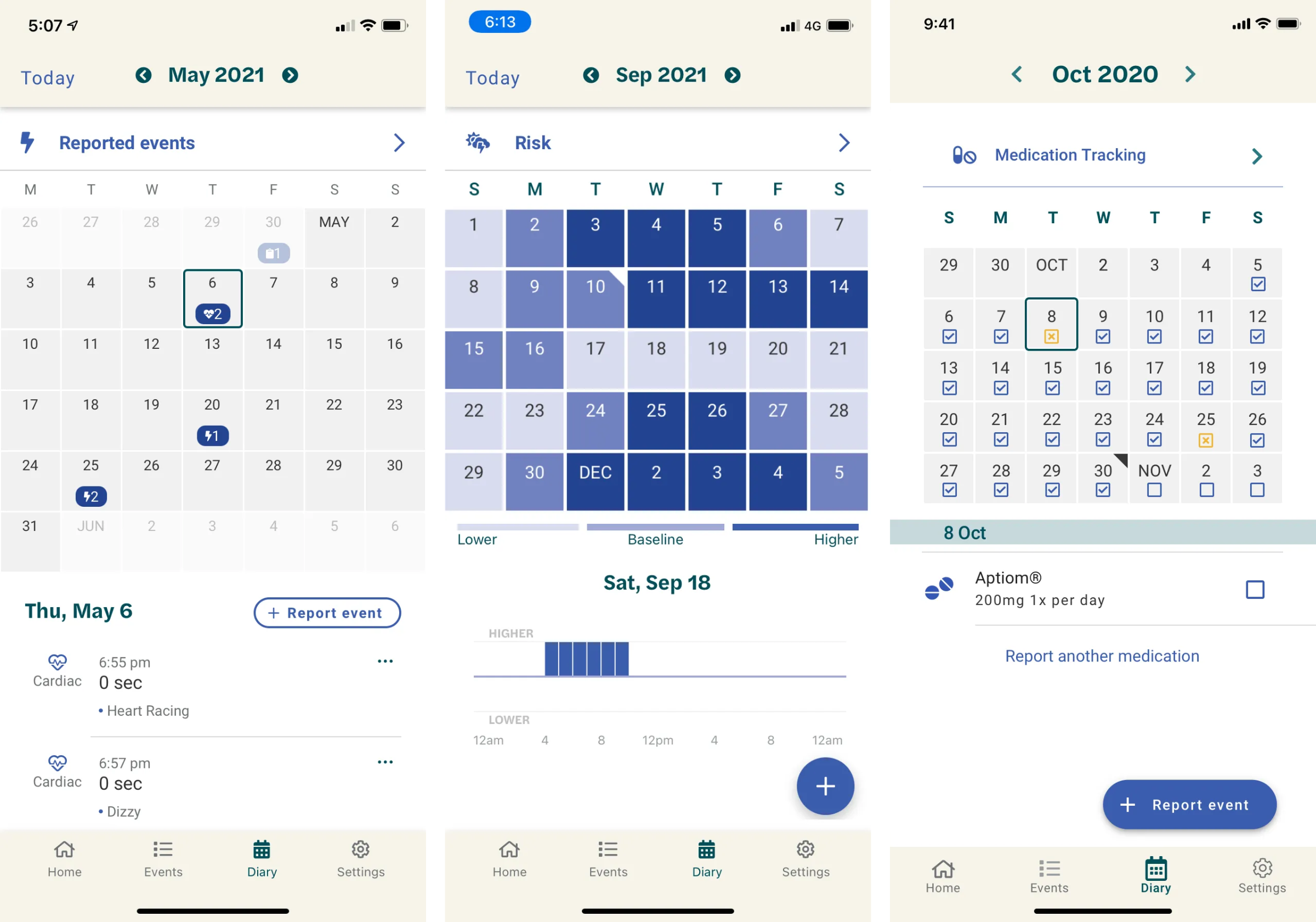
An existing feature planned for summarising patient insights established a foundation that could be evolved to include the risk forecast, initially for the web experience to measure and evaluate performance with allowed user data, and later integrated into the mobile app to support ongoing research.
We shared plans and findings with consortiums and other working groups while working toward grant milestones. Additional designs focused more on hourly risk views as these users would likely see solid coloured calendars, particularly for clock faces that could be checked at a glance for users with daily events, perhaps integrated to an Apple Watch clock face or a more affordable FitBit view. We also had a full annual calendar view where days across all 12 months could be highlighted for people with semi/annual/biannual events, though these users required longer historical time cycles to have enough data to reasonably calculate.
While certainly exciting, and tons of effort for all involved, getting to launch day was never meant to be the end of my story with Seer, but a beginning. As with any new designs, esp when based on cutting edge science for the medical field, rigorous testing needs to be conducted safely. But unlike with TV or online shopping, Figma screenshots alone can’t ethically assist someone living with epilepsy to evaluate new tech for living with personalised forecasts of their unpredictable seizure events.
Significant changes on the leadership team massively affected the focus and direction of work. Just as my team had finally grown from 1 designer to 3, new direction quickly zigged and zagged from having no design org to subsequently hiring a full design team with more than 15 people, including research, UX, visual design, and integrated with designers from brand and marketing. The swift growth was also marked by rounds of mass layoffs just a short time afterwards. Following successful FDA clearance and work to open clinics in the US, eventually, Seer announced recalls followed by shuttering all clinics, and they are now moving through Voluntary Administration.