For my first major project at Target, I took handover from an outgoing UX/UI Designer. Lots of detailed work had been put in so far from mapping the journey to identifying objectives. The previous workshops and resulting Axure wireframe prototype test was available for me to pick up.
For my part, I started with understanding the current experience, and getting familiar with the current visual language as well as the technical constraints. Also, the scope was not to fundamentally redesign of the entire look and feel, so we could refine existing UI patterns to get a more realistic sense of user behaviour during testing. I also captured a bunch of competitor checkout experiences from the some of the biggest brands globally, as well as other Wesfarmers group companies.
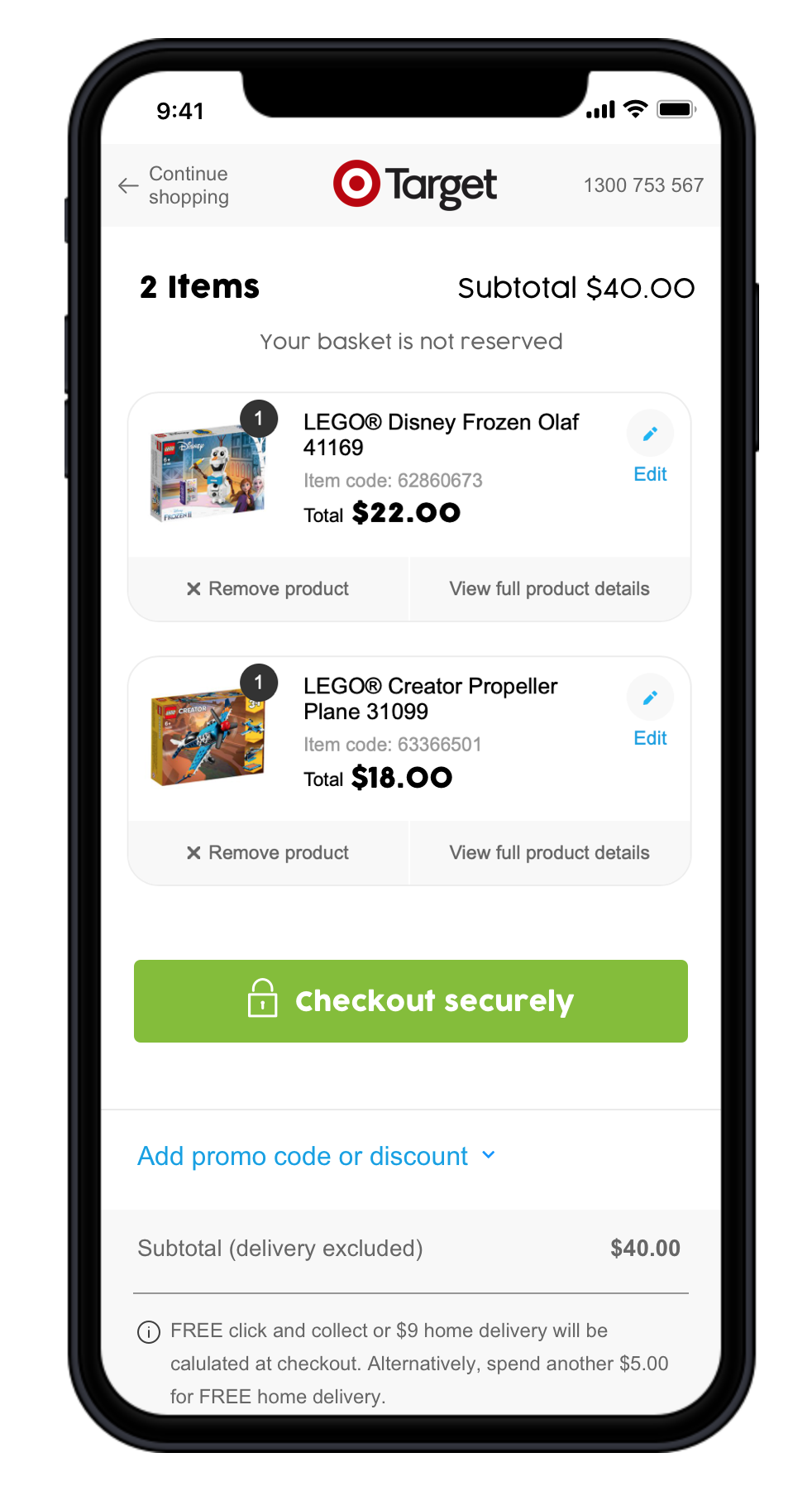
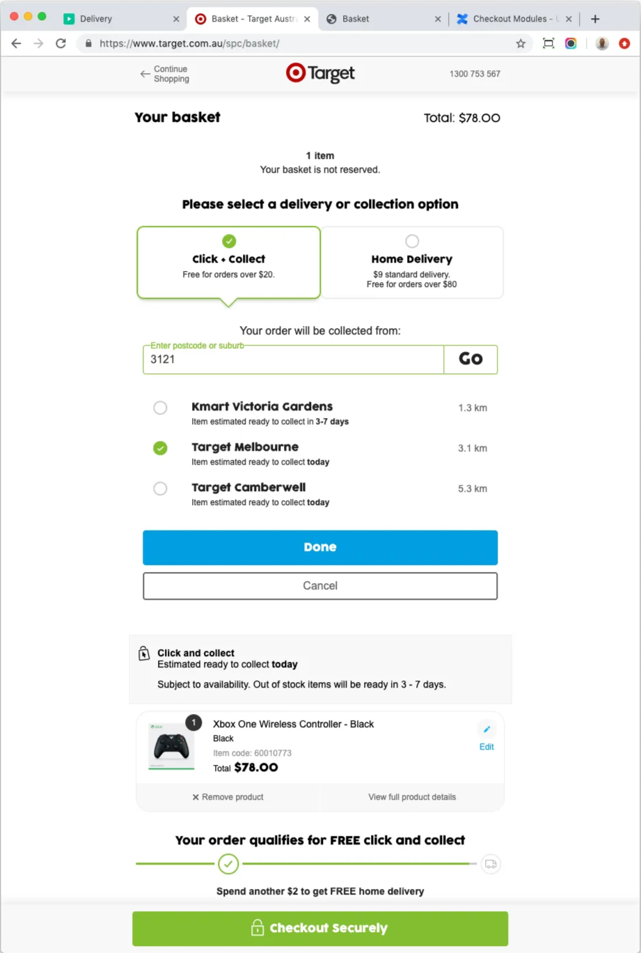
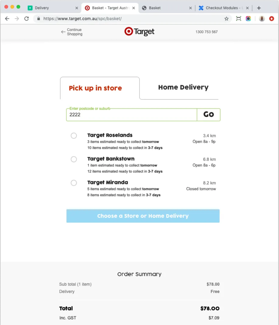
Once I started to understand the existing experience better, some of the usability challenges became more apparent. For example, some items added to basket from the shopping experience may not be available for in store collection at checkout, collection times varied depending on where multiple items were each shipping from, and some items may not be available for home delivery.
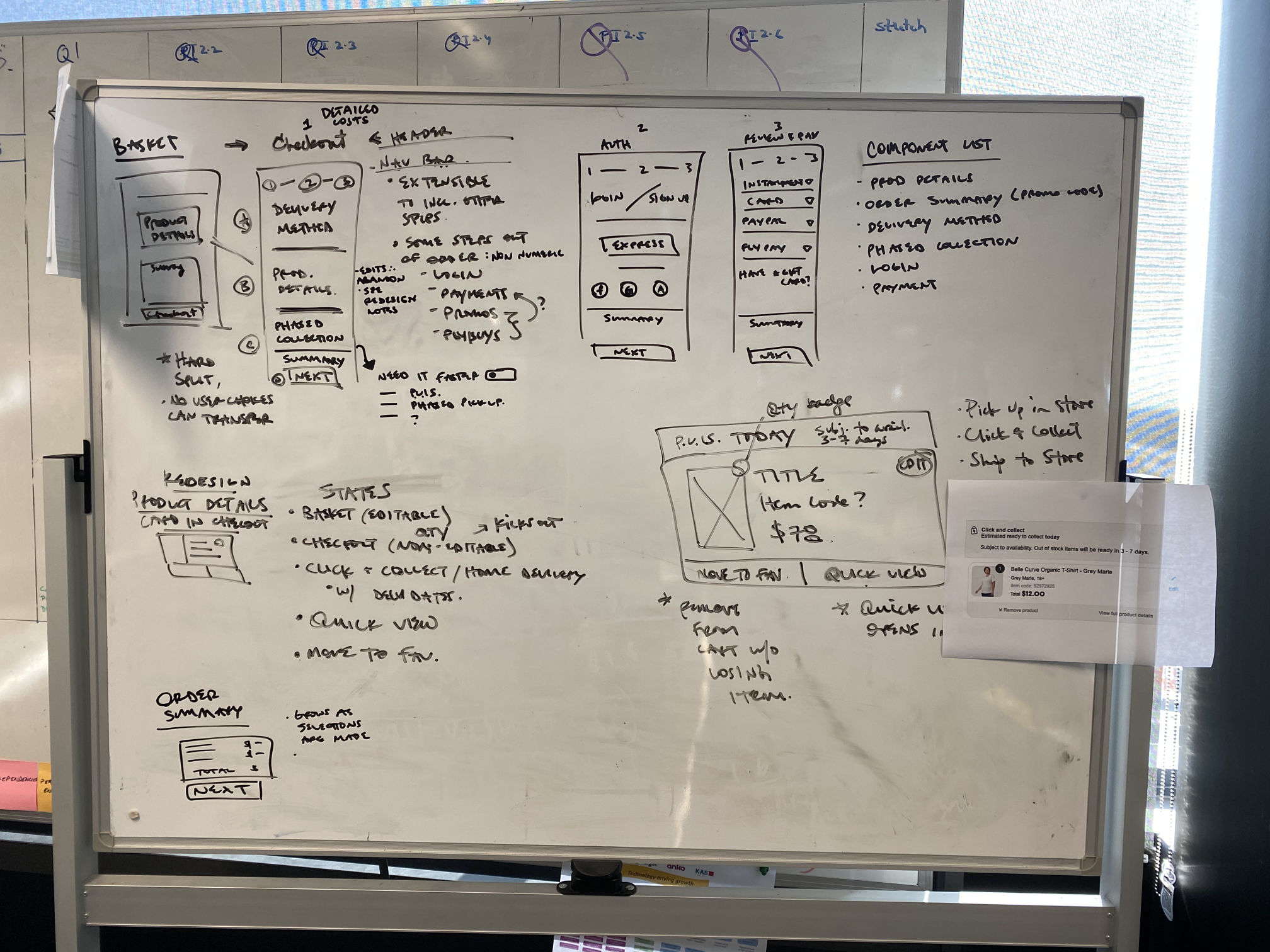
My early concept sketches aimed to utilise more of the available page width and focus the displays on the task/JTBD. I quickly learned the mobile checkout experience relied on the same web designs, without the possibility in this project to become adaptive/responsive to the browser type or viewport sizings. So we kept designs to mobile widths and focused testing on mobile scenarios.
Existing/BAU
Concept Sketch
This is an example of my early sketches that aimed to simplify the speech bubble radio buttons into tabs, removed the active ‘done/cancel’ buttons for a process that wasn’t done, and focused the screens on specific steps/JTBD in the checkout flow.
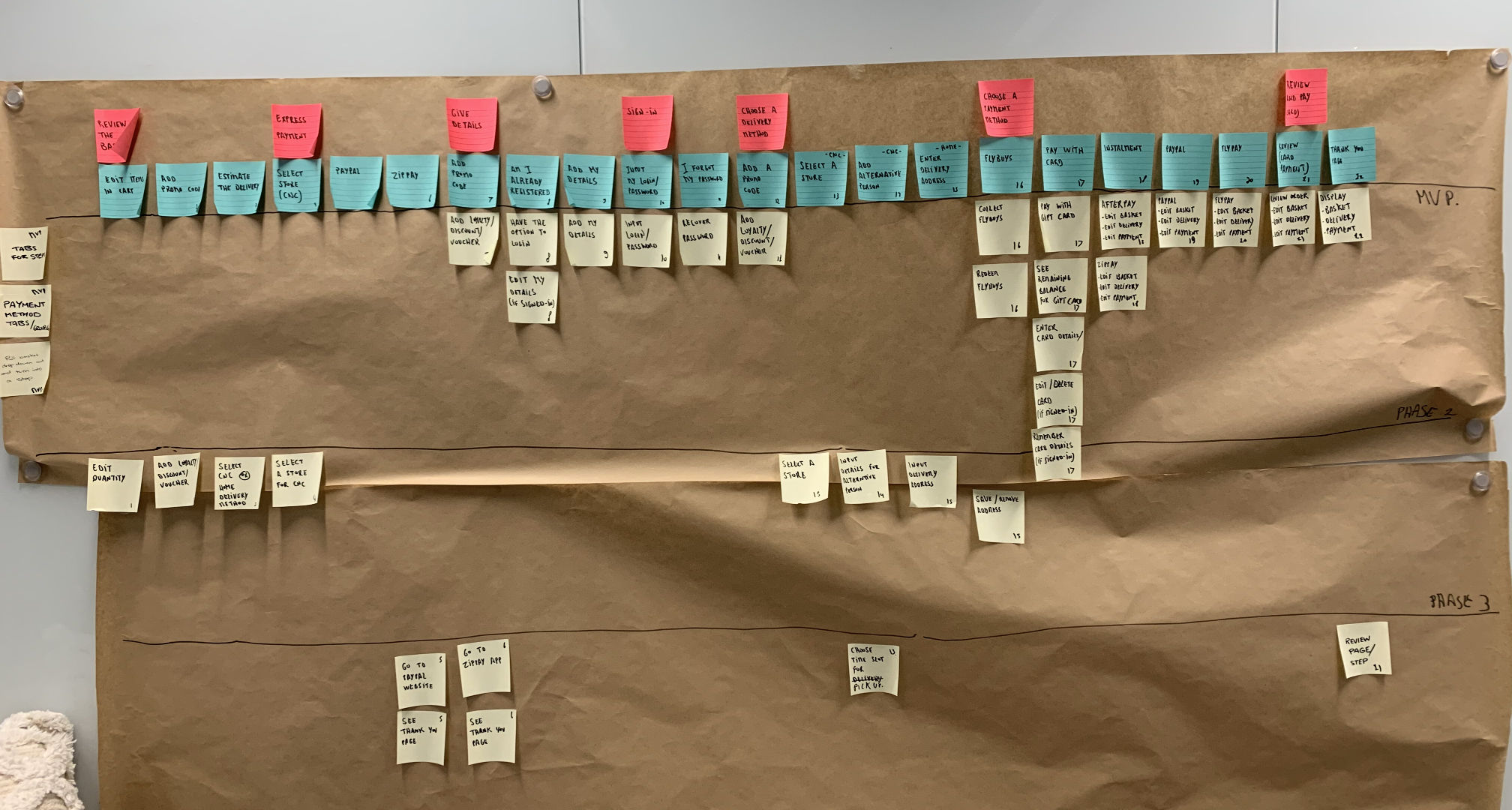
I broke down the checkout experience into various modules so we could refine or reorder each step in the journey. The UI team could work on updates to the payments options from the first rounds of testing while we continued to refine the overall structure of the checkout flow.
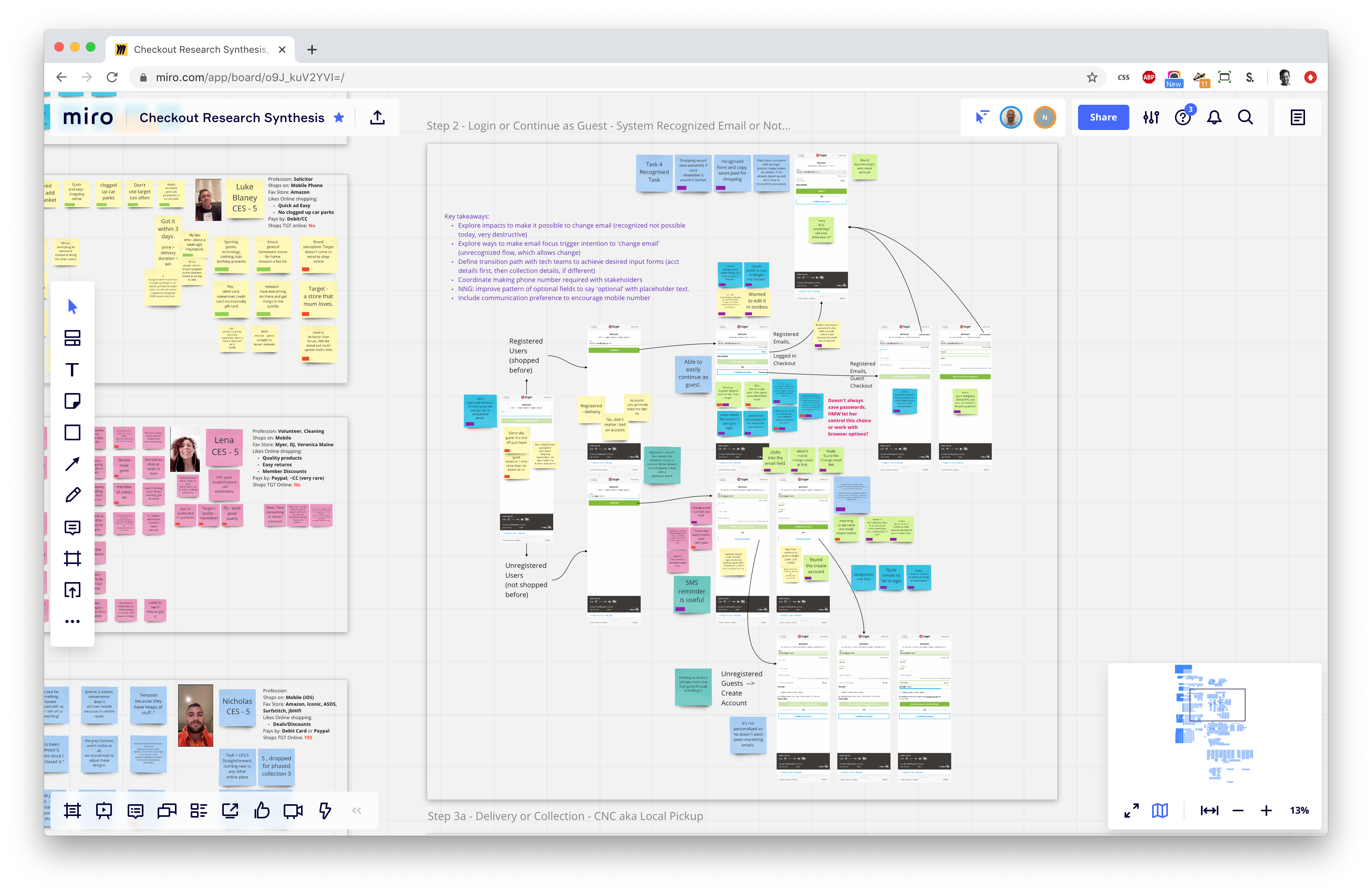
I built these screens with accepted UI refinements included to support our next round of user research testing. I worked with our research team to define the scope and questions to recruit some testers. We synthesised all the results in Miro to focus how best to further refine the screens and flow.
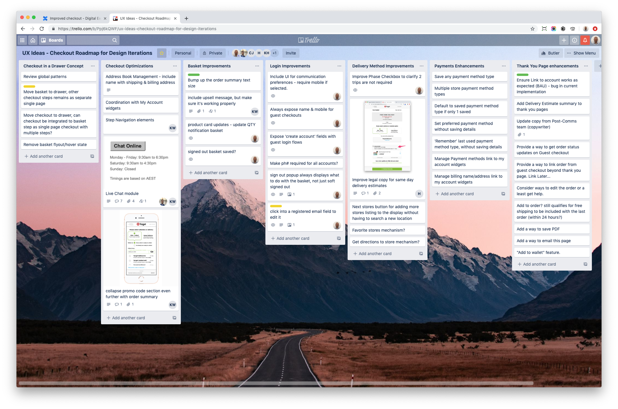
Using Trello, I mapped out various parts of the checkout updates in progress across the team to keep everyone on the project informed and design delivery schedules on track.
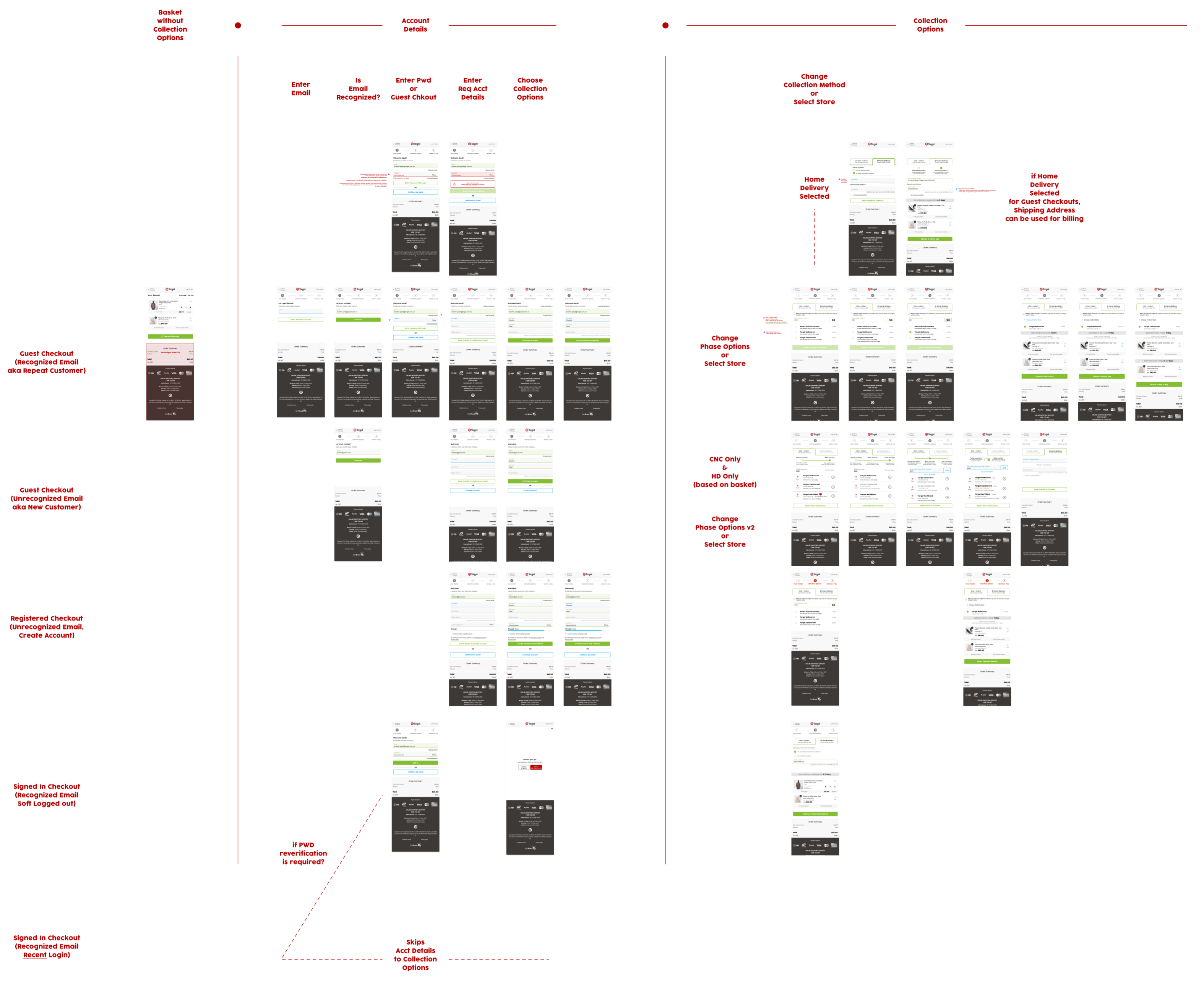
Tons of updates went into the project covering everything from the returning user account login to the new user registrations. We reduced the data being collected to support the best journey so account addresses weren’t necessary on signup for somebody choosing to collect items in store. We also improved the guest checkout experiences by offering a way to create an account following the checkout experience by adding a password to claim accounts after checkout.
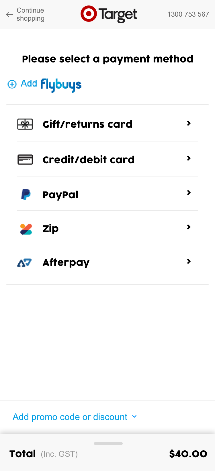
In parallel the UI was cleaned up for the various ways to pay, simplifying the experience and presentation into a unified module that improved web and mobile while preserving the various payment methods, including 3rd party experiences. I consolidated all the designs into a single unified prototype that could demonstrate the end to end experience and support further research initiatives.